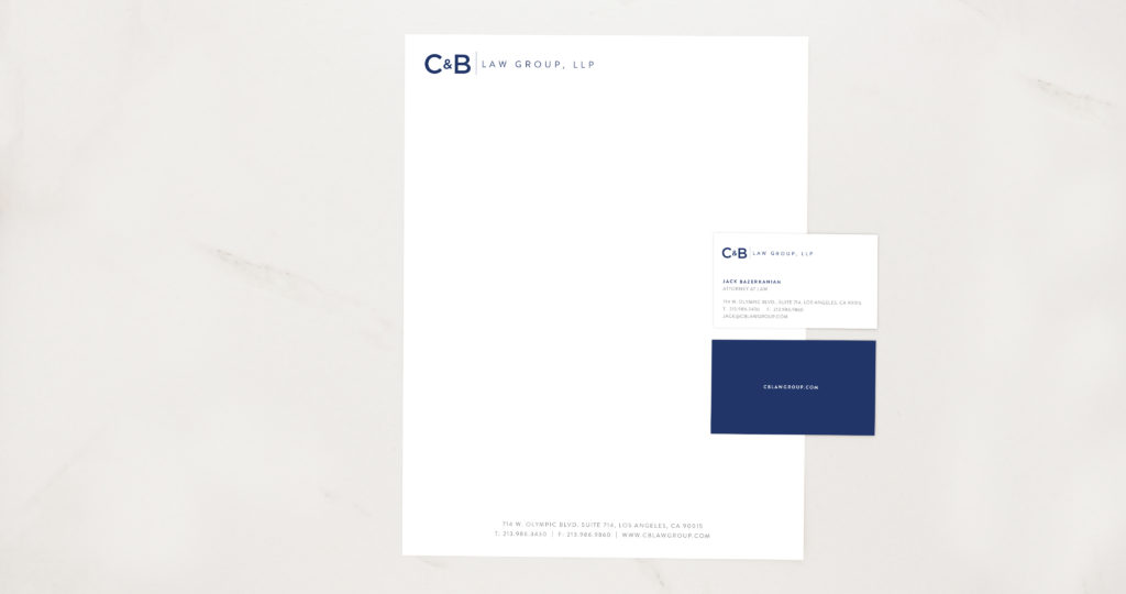
Your business stationery is a first-hand representation of your company to the public. As such, it needs to convey an overall company message. In many ways, the design of your company’s stationery should have the same elements as other print or digital design, as all designed material should be considered as a coherent segment of your branding strategy.
Successful print design will add authority to the business letter that has been written, regardless of whether you have written a standard business letter or a sales letter. Your business stationery will be used for multiple purposes and may be an initial introduction of your company, or it could be used to further your brand identity. Regardless of how your company collateral is used within each situation, it’s imperative that you design effective stationery.
Follow the Rules of Simplicity
Company stationery should have a simple layout without unnecessary clutter. The design of your business stationery should be simplistic and clean. A clean design allows brand awareness and provides focus to your content.
5 Elements to include within your Business Stationery
The elements within your professional stationery are essential to increasing your brand awareness. Design elements will need to be within all collateral, and follow from page to page. Whether sending a single page or five pages, all pages should have the same elements.
These 5 stationery design elements will help to increase brand awareness, and develop your company presence into a leading authority within your industry.
1 — Header and Footers
All business stationery should include some sort of a header and footer. When creating a header for company collateral, you’ll need to use the same style that was used with company material. Your business card design and website should fully match your company’s stationery.
Your corporate stationery is another portion of brand identity. If it alters from your business cards and website, it can be confusing to customers and the public — the recipients may very well believe that it is from another company. This misconception could lead to your business letters be trashed, or if your company name is recognised, it could appear unprofessional.
Your header and footer will also be the location of vital elements, including available ways to get in contact with you. Leaving a header and footer out, will limit the effectiveness of your business stationery as a communicative tool. Additionally, the absence of a header and footer can take away from your professionalism.
2 — Contact Information
Contact information should be part of the design elements of your business stationery. It consists, at a bare minimum, your company name, address and phone number. If you have a fax number, it could also be listed. To compete within a virtual world, you should consider providing an email address and website address.
Adding social media elements within your contact information is appropriate, provided that you don’t go overboard. Just stick with the basics, such as Facebook and LinkedIn. The two primary social media outlets for professional businesses are Facebook and LinkedIn, Facebook, for a broadened reach and LinkedIn as a professional representation.
You may also want to include Twitter, though it isn’t necessary. If you do choose to include Twitter, be sure that you stop with Twitter. Adding too many social media contacts can quickly clutter up your design overall.
3 — The Importance of a Company Logo
Including your logo design on your business stationery is essential in identifying your company among recipients. It provides them with instant brand recognition, thereby increasing your brand awareness. When placing your logo into your stationery, be sure to align it on the top of your letterhead design, within the middle or to the side. A preferred location for side logo placement is to the left. Logos should be free from other images and text, to ensure there isn’t confusion with business letter recipients.
When choosing a logo, make sure that you are using the same logo that is on your business cards and website. Small startups often mistakenly create separate logos for differing purposes. This can dilute brand awareness, thereby limiting the potential of a logo. To strengthen a company logo, use the same logo for all purposes and have a simplistic, yet bold design.
4 — Following a Select Colour Scheme
Colour is an essential design element to creating effective business stationery. Colour can provide a general style and flow. Additionally, it can be used to further brand identity.
When determining a proper colour scheme, you should typically follow the colour palette used throughout your website, business cards and other branding materials. This will ensure that your company stationery is aligned with the branding material that has already been promoted. Additionally, it will avoid confusion with other companies.
If by chance, you have yet to create a website or any other business material, you’ll need to determine an effective colour scheme. This can be done by evaluating your specific industry through a competitive or market research process. Hair salons, beauty supply stores, female clothing stores and other similar industries can lean towards soft, pastel colours. In contrast, repair shops, business consulting firms, financial advisers and other like-minded specialities could choose a more bold colour scheme. Children, fitness and some novelty industries can slide by with a vibrant and contrasting colour scheme.
As a general rule, two to a maximum of three colours should be used throughout a colour palette. The colours chosen should be complimentary, with just a slight altering from the base hue. In the case of an industry that can support contrasting colours, the colours chosen should still remain below three, to avoid distractions. Once a colour scheme is chosen, it needs to be a repeating feature throughout all business documents, branding material and marketing campaigns.
5 — Choosing Appropriate Paper or Card Stock
When selecting a particular stock to be used within all business stationery, you should follow the general rules of choosing a colour scheme. The stock colour or texture should coincide with your industry. A computer repair shop should stay clear of stock with hints of lavender, just as a beauty salon would want to avoid shades of mahogany. An always-safe alternative are shades of grey, tan and cream. If texture is added to stationary, be sure to keep it simple and professional.